Pink is everywhere right now. If you’ve noticed the trend and are wondering why it’s so hot, look no further than the box office. The U.S. has caught Barbie fever in anticipation of Greta Gerwig’s new movie, Barbie, which premiered on July 21, 2023.
While many are embracing the pink trend in their wardrobes, others are incorporating it into their homes. It may seem as if this pink invasion came out of the blue, but the hue has a longstanding history in design and has been leveraged in homes for more than a century.
From bubblegum pink to rose gold tones, let’s explore the rich history of pink interior design—plus, how to incorporate pink into your own home.
The Victorian Era: Mid-1800s to 1900

The Victorians were known for their maximalist aesthetic. Think patterned walls, colorful tiles, tapestries, and elaborate ornamentation. While rich green wallpaper enhanced by arsenic was popular according to the RISD Museum, the much safer pink was often used as an accent in Victorian homes.
“Pink hues, such as delicate rose or dusty pink, were utilized in wallpapers, upholstery fabrics, and draperies,” Liam Davis, an art historian at Art File Magazine, told Forbes Home. “These soft pink shades, often combined with other pastels, were incorporated into intricate floral motifs, contributing to the overall ornate and romantic aesthetic of Victorian interiors.”
The Age of Jazz: The 1920s
The Art Deco style influenced interior design during the 1920s. According to Christina Dikas, a senior architectural historian, this style is known for its geometric patterns, angular shapes, and elongated lines. Pink was often combined with gold, silver, or black to create a glamorous look.
Popular shades of pink during this era included dusty rose, blush pink, salmon, pastel, and shell pink which were incorporated into wallpaper, upholstery, and accessories. Floral patterns were also popular during this time.
Hollywood and Hard Times: The 1930s and 1940s
The 1930s and 1940s showed two different pink aesthetics. On the one hand, the sleek Art Moderne style emerged, which, according to Dikas, was based on the transportation of the time. Cars were already used and airplanes were gaining popularity. Like a speeding blur in the sky, the concept of streamlined, horizontal lines was favored in this design era.
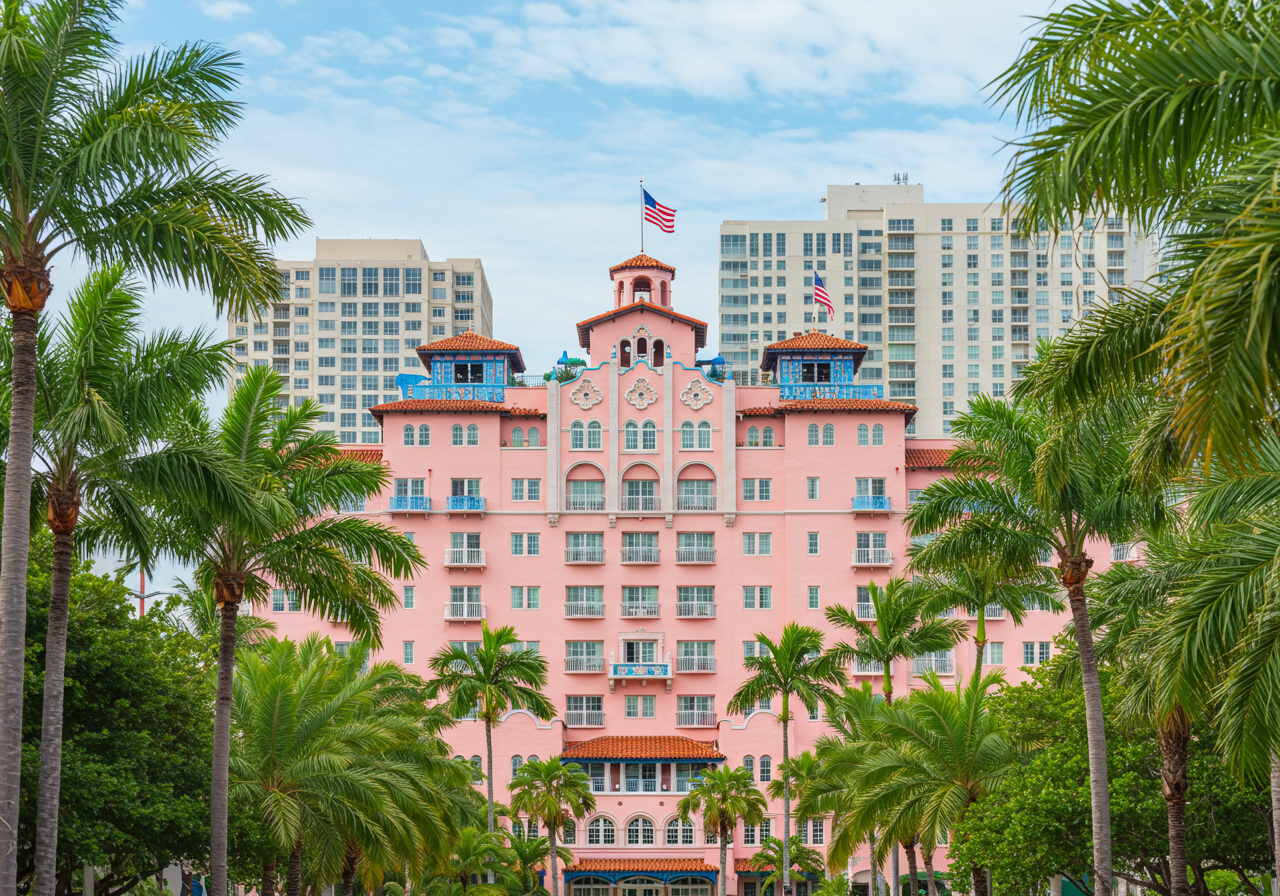
On the other hand, it was also Hollywood’s Golden Era, which marked the use of brighter pinks in places reserved for the rich and famous. The Royal Hawaiian Hotel in Honolulu, which is shown below, was built in the ‘30s and is a good example of this color trend.
This era also marked a time of hardship for most people in the U.S. due to the Great Depression and World War II. For most, if pink was used at all, it was a softer shade combined with neutral or earthy tones.
America’s Golden Age: The 1950s

During World War II, designers devoted a lot of effort to studying colors to use in camouflaging tanks, uniforms, and naval ships. This meant seeing a lot of browns and greens, said Dikas. Coming out of the war, bright colors were used in contrast to army green, symbolizing a fresh start. “That’s why we see a lot of pink in the 1950s, post-war era,” she said.
Enter pink kitchens and bathrooms. Popular shades included flamingo pink, bubblegum, and cotton candy pink. One of the most iconic pinks to come from this era, according to The White House Historical Association, was “Mamie Pink” named after First Lady Mamie Eisenhower, who popularized the color by using it extensively in the White House.
Mid-century modern furniture was also popular during this era. It ushered in trends of clean lines and organic shapes. Pink lent itself well to this trend and was often paired with other bold colors like turquoise and yellow.
The Groovy Years: The 1960s and 1970s
Love it or hate it, the ‘60s and ‘70s were known for bold graphics, colorful prints, and groovy designs. Color palettes were split into two camps during this time: psychedelic and earthy. On one side, these decades favored bright bold shades like hot pink, fuschia, neon pink, and magenta. These pinks were often paired with geometric and psychedelic designs. They were also used in pop art, popularized by artist Andy Warhol.
On the other side, these decades also highlighted an earthy, boho style that was especially popular in the ‘70s. Interior designer Sahil Mehra said certain pinks paired with earthy design seemed all-encompassing.
“Earthy and dusty pinks like terracotta and mauve were the stars,” Mehra told Forbes Home. “They blended beautifully with natural textures and patterns.”
Bigger Is Always Better: The 1980s
They say everything was bigger in the ‘80s, but we’re not just talking about shoulder pads and hair. Interior design also tended to be over-the-top. The influence of Miami Vice and the Memphis Design movement promoted bright colors. Hot and neon pinks were commonly used in furniture and decor to create a more futuristic look.
Metallic accents and decor were also popular. You could find pinks paired with chrome or brass. Metallic pink wallpapers were even an option.
The Age of Mauve: The 1990s and 2000s
The next 20 years were marked by minimalistic design. While some vibrant pinks were trending throughout culture (think Lisa Frank), pinks were less popular in home design. When they were used, they were more on the soft and muted side and included shades like gray-mauve.
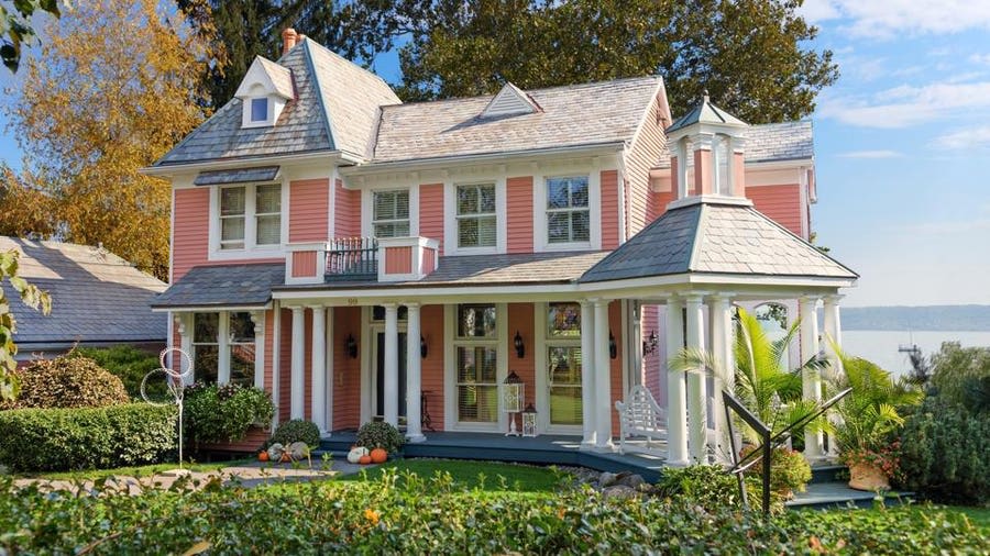
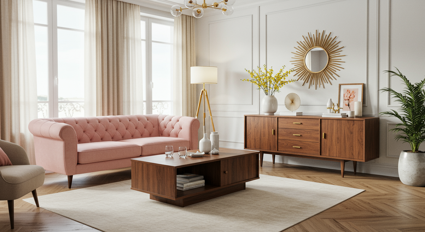
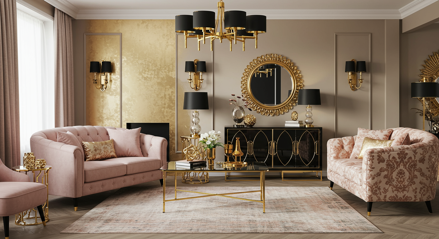
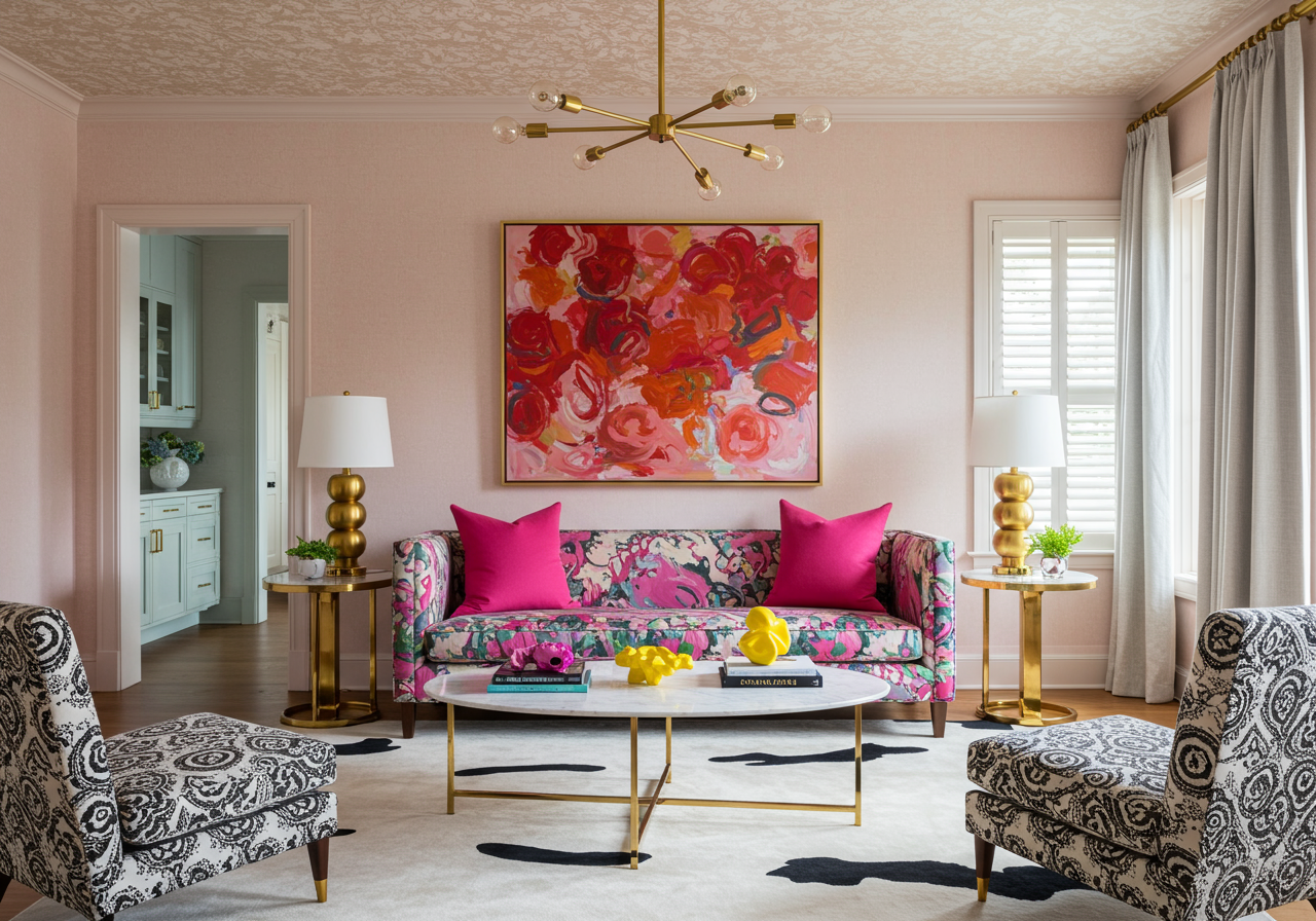
The Pink Revival: The 2010s to Now
Lisa Peck / LiLu Interiors
The Future: 2024 Pink Predictions

We’ve seen what shades of pink history has to offer, but what about the future? We asked several interior designers about their pink predictions for 2024. The predictions were split into two main categories– the bright and bold, and the calm and the earthy. Among others, the bold colors included hot pink, fuchsia, raspberry, and magenta.
The growing interest in bright colors was attributed to the new Barbie movie and the subsequent Barbiecore trend. Popular among the subdued shades were millennial pink, blush, dusty pink, and rosy terracotta. Some designers pointed out that the use of earthy tones correlates to the increasing public interest in the environment.
5 Tips for Incorporating Pink Into Your Home
1. Paint a Door
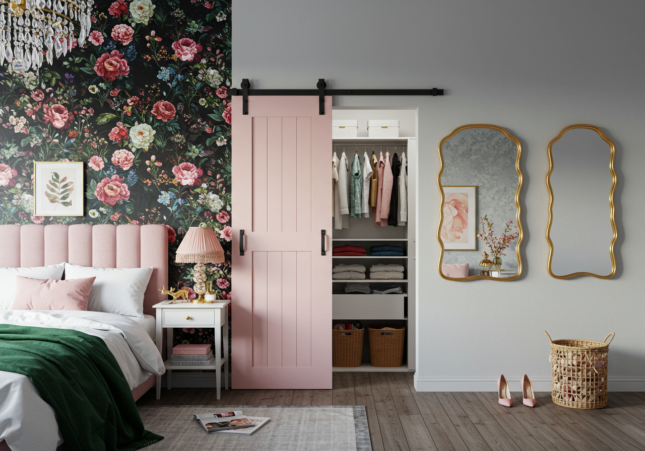
If you aren’t quite ready to dive in head first and paint your whole house pink, try painting a door inside your home. Keep it simple with some softer tones of pink like the one above. The pastel shade of this closet door has a calming effect, perfect for an area like the bedroom. If you feel more adventurous, you could even paint your front door.
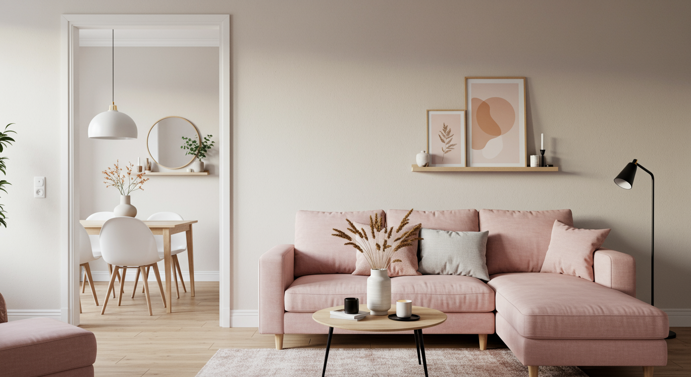
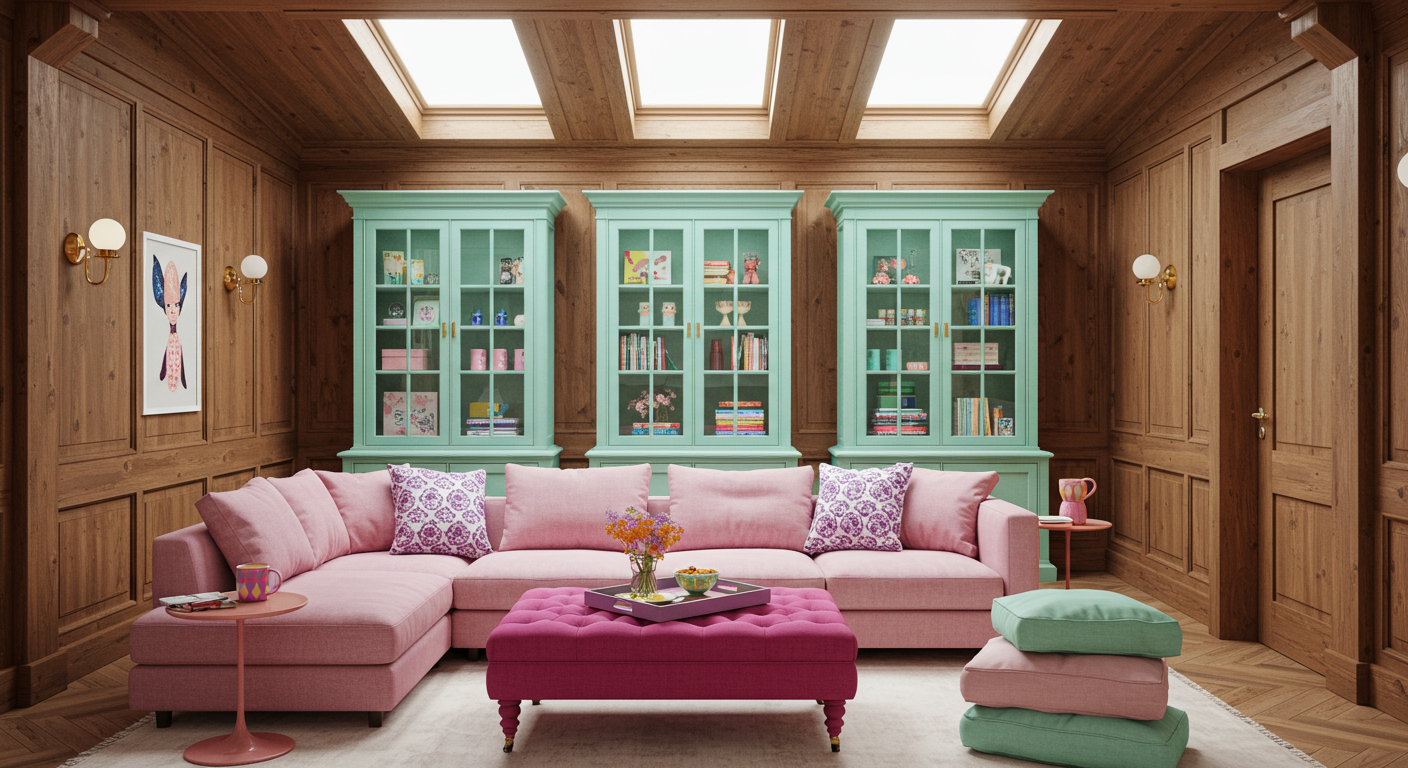
2. Add Subtle Details
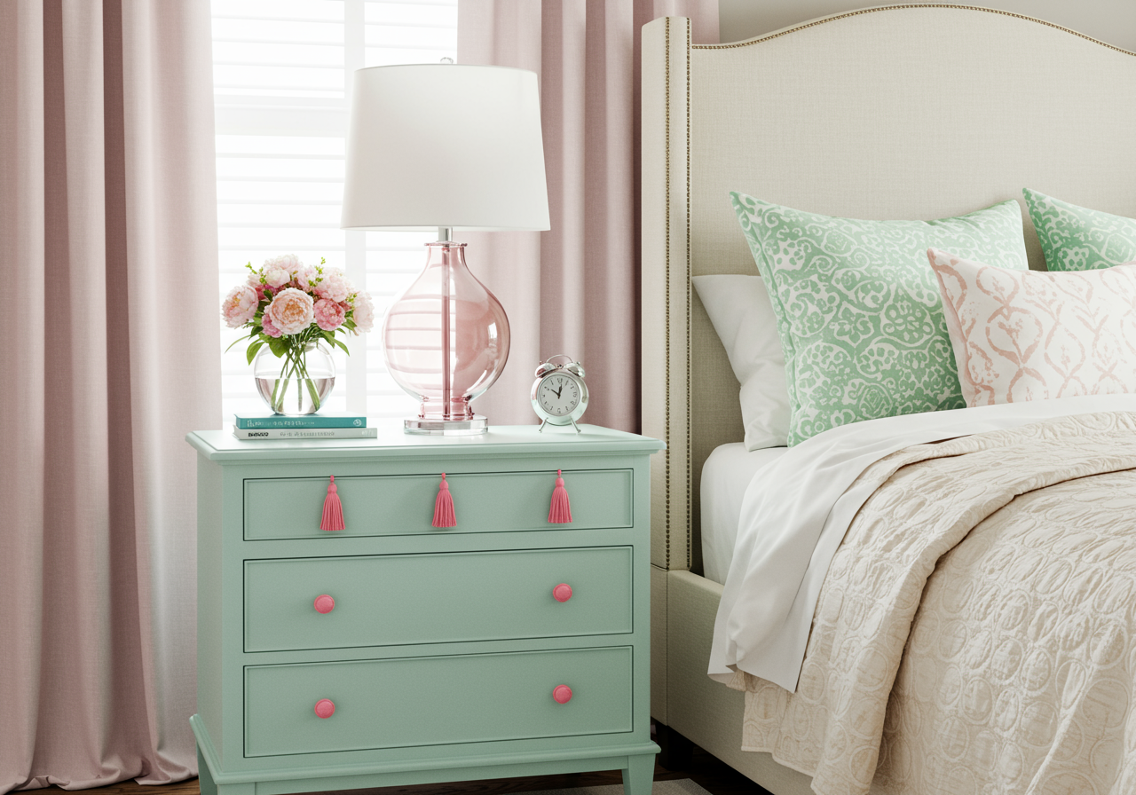 Lisa Peck / LiLu Interiors
If you are looking for something more nuanced, focus on the small details. We love the Barbie pink dresser hardware in the design above, which is also easy to switch out. Consider other subtle pink details such as a chic lamp, throw pillow, and a vase of light pink flowers. For even more pink, add some curtains in a muted or soft tone.
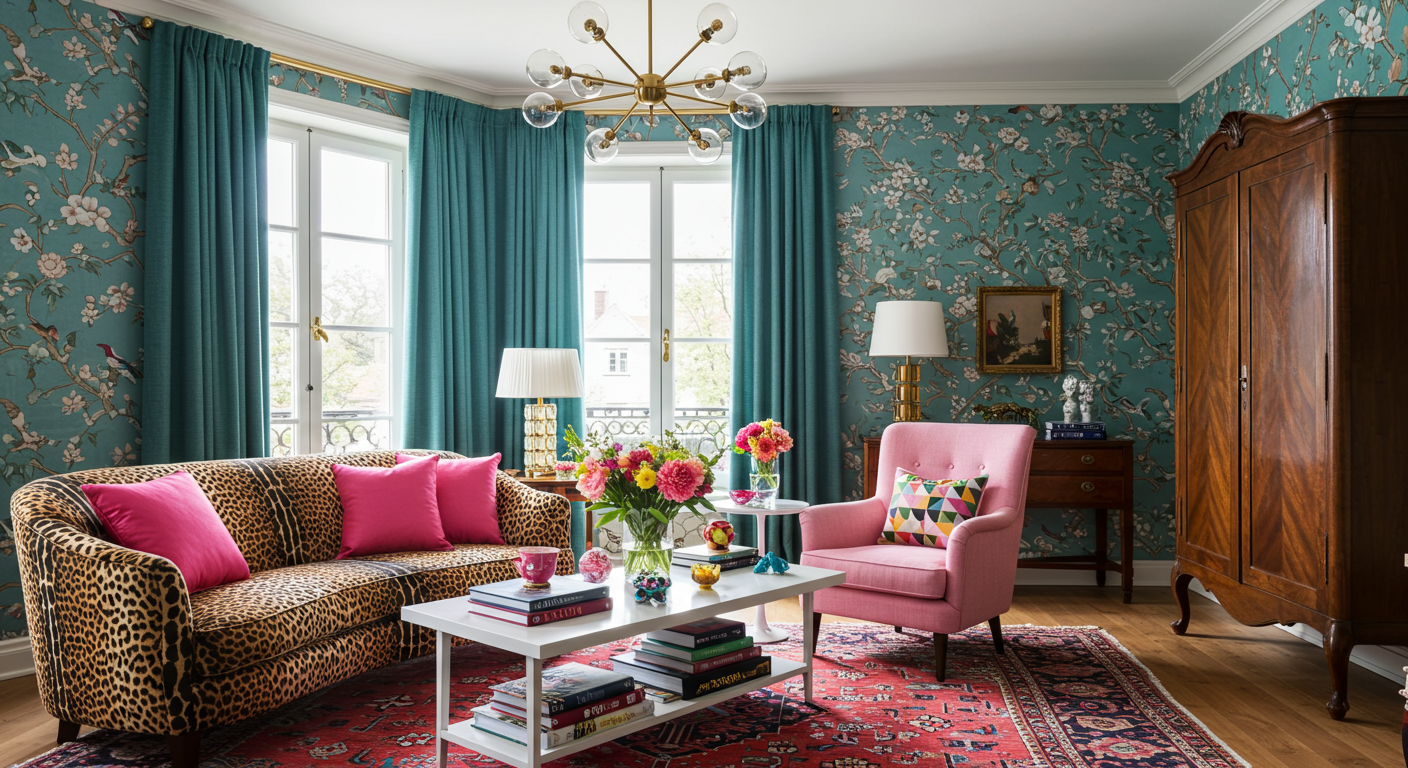
3. Hang Some Wall Art
Jim Schmid / Ashley DeLapp Interior Design
4. Paint or Wallpaper an Accent Wall
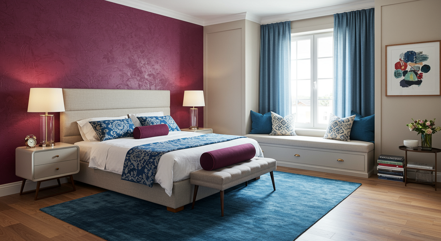
What better way to make a statement than by embracing a pink accent wall? One wall is a relatively low commitment that gives you a chance to try out the color in your home. Plus, it offers a great balance between trendy and fun and stylish and sophisticated. Add some matching pink accessories around the room for an even more cohesive look.
5. Accessorize With Pops of Pink
If you’re apprehensive about committing to pink on your walls or doors, opt to utilize the shade in your furniture and upholstery. If you don’t want to spend a lot of money and enjoy a weekend DIY project, you could even paint or reupholster an existing chair. Otherwise, another simple way to bring pink to your living space is with a few smaller details, like accent pillows or small bits of decor.
*Quotes have been edited for length and clarity.